PENSIL AJAIB
Generate clear, consistent placeholder copy without leaving your design
PROJECT INFO
- ROLE
- DESIGN ENGINEER
- YEAR
- 2025
- TEAM
- CLIENT
- INA DIGITAL EDU
PENSIL AJAIB
Generate clear, consistent placeholder copy without leaving your design
PROJECT INFO
- ROLE
- DESIGN ENGINEER
- YEAR
- 2025
- TEAM
- CLIENT
- INA DIGITAL EDU

Overview
In public service products, placeholder copy is not just a design inconvenience but it actively misleads stakeholders. When non-technical reviewers see lorem ipsum or generic labels in a government flow, they either skip feedback entirely or misread the product's intent. Either way, real decisions get delayed.
Pensil Ajaib is an internal Figma plugin I built to solve this for our team. It connects directly to a structured content guideline system maintained by Atika and content designers — and uses an AI model via OpenRouter to generate contextually relevant copy suggestions based on the component type, audience, and product context. Instead of tab-switching across tools, designers get relevant copy suggestions without ever leaving Figma.
Problem
Placeholder copy drives product conversations. When it drifted from our guidelines, stakeholders fixated on wording instead of UX or flows especially in public services where most stakeholders are non-technical.
We had Ketik GPT (internal AI writing assistant) for better copy, but designers had to screenshot mockups, describe context externally, refine output, then paste back into Figma. Six steps. Too much friction.
How might we bring guideline aligned copy directly into Figma without tool‑switching?
How might we respect product and audience differences automatically so designers don't need to memorize rules?
How might we give content designers cleaner starting points instead of fixing messy placeholders?
My Role
I was responsible for the full engineering side of Pensil Ajaib, designing and building the Figma plugin from scratch, using React, architecting the Cloudflare Workers backend, and integrating OpenRouter for model inference.
Atika led the content side: restructuring our copy guidelines into a machine-readable format, defining the taxonomy of product contexts and audience types, and maintaining the guideline system that the plugin queries.
This was a deliberate split because good plugin output required both strong engineering and well-structured content. Neither worked without the other.
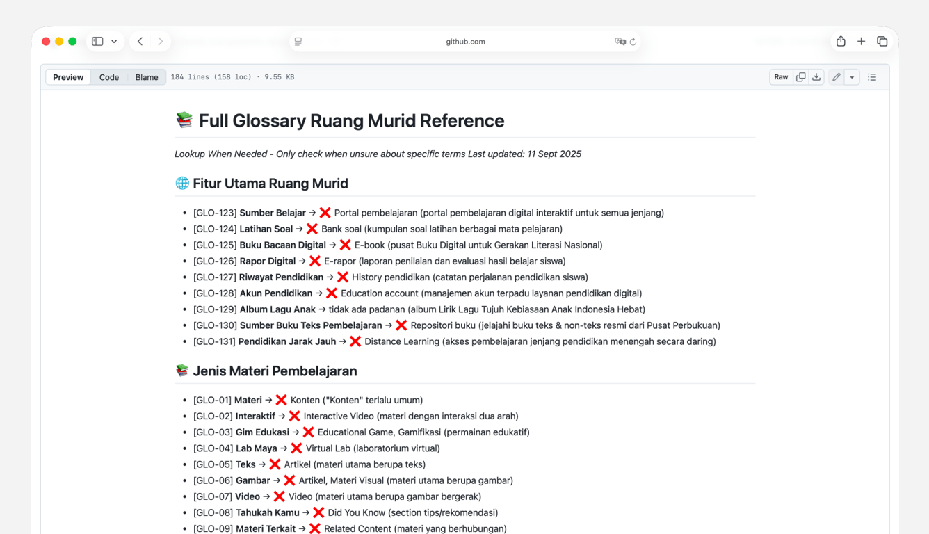
Content System
Our guidelines — tone, glossary, audience rules, component patterns — were written for humans, not machines. Before building the plugin, Atika restructured everything into modular Markdown files in GitHub, organized by product, component, and audience type.
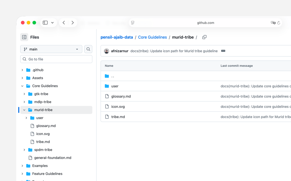
Each entry carries a unique ID and an audience context flag (e.g. low-literacy, general public, admin). This structure is what makes the plugin's suggestions relevant rather than generic — the model doesn't guess; it's scoped against a real guideline set that the content team actively maintains. Getting the taxonomy right took multiple folder structure iterations before suggestions became genuinely useful.
The Plugin
Pensil Ajaib lives as a panel inside Figma. A designer selects a component, picks the product and audience context, and receives copy suggestions drawn from our guideline system. The interaction is intentionally minimal — the goal was to feel like an extension of the design environment, not an interruption.
The workflow went from 6 steps to 3:
- Select a component in Figma
- Set product + audience context in the panel
- Apply suggested copy
Behind the scenes, the plugin constructs a structured prompt from the selected context, queries, and filters the output against our guideline IDs so suggestions stay within the bounds of what our content team has approved.
Plugin Experience
Lock Screen
Simple access control for internal use, keeps the plugin contained to the team without requiring a complex auth system.
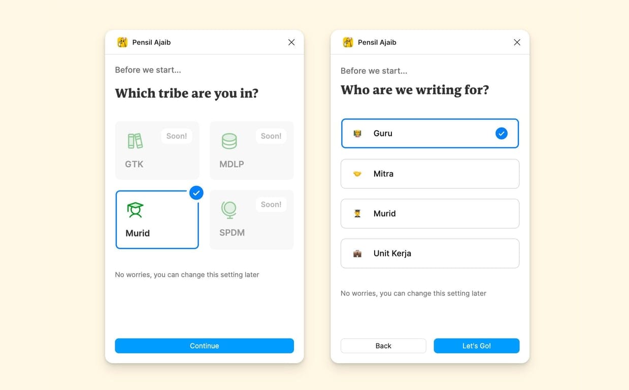
Setup Product & Audience
Designers first select which product and which audience they're designing for. This tells the plugin which guideline subset to use, a low-literacy public audience gets fundamentally different suggestions than an admin user.
Scope Selection
Choose a single layer, multiple layers, or a full frame. An optional context field lets designers add extra detail when the layer name alone isn't enough.
Three Variations + Rationale
The plugin returns three aligned options, each with a short rationale — e.g. "uses official term X", "simplified for low-literacy". Designers can apply one, regenerate for new options, or apply all at once.
llustration
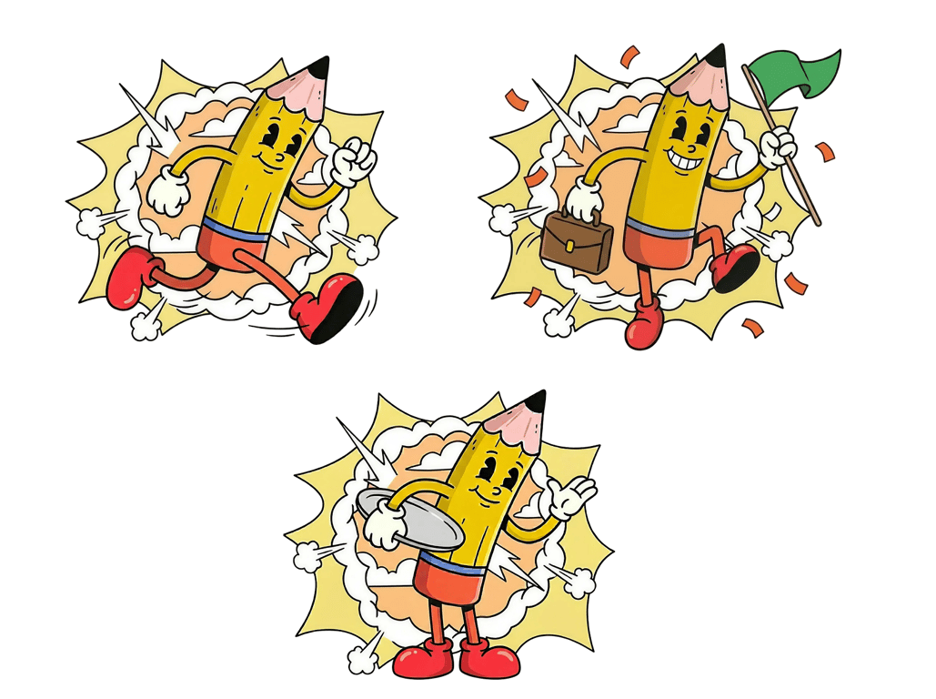
We started with AI exploration using Nano Banana Pro to sketch mascot concepts quickly.
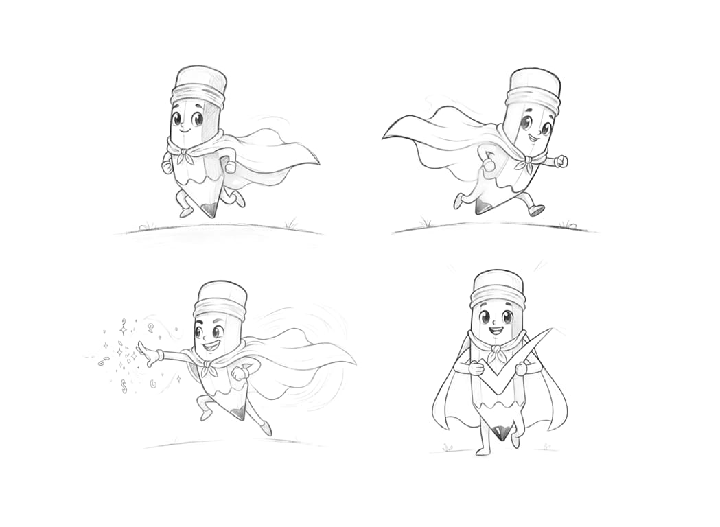
Then worked with illustrator Adriansyah Mursalin to hand-draw the final version. The cheeky expression and relaxed vibe fit the plugin's personality, a quiet assistant, not a loud feature.
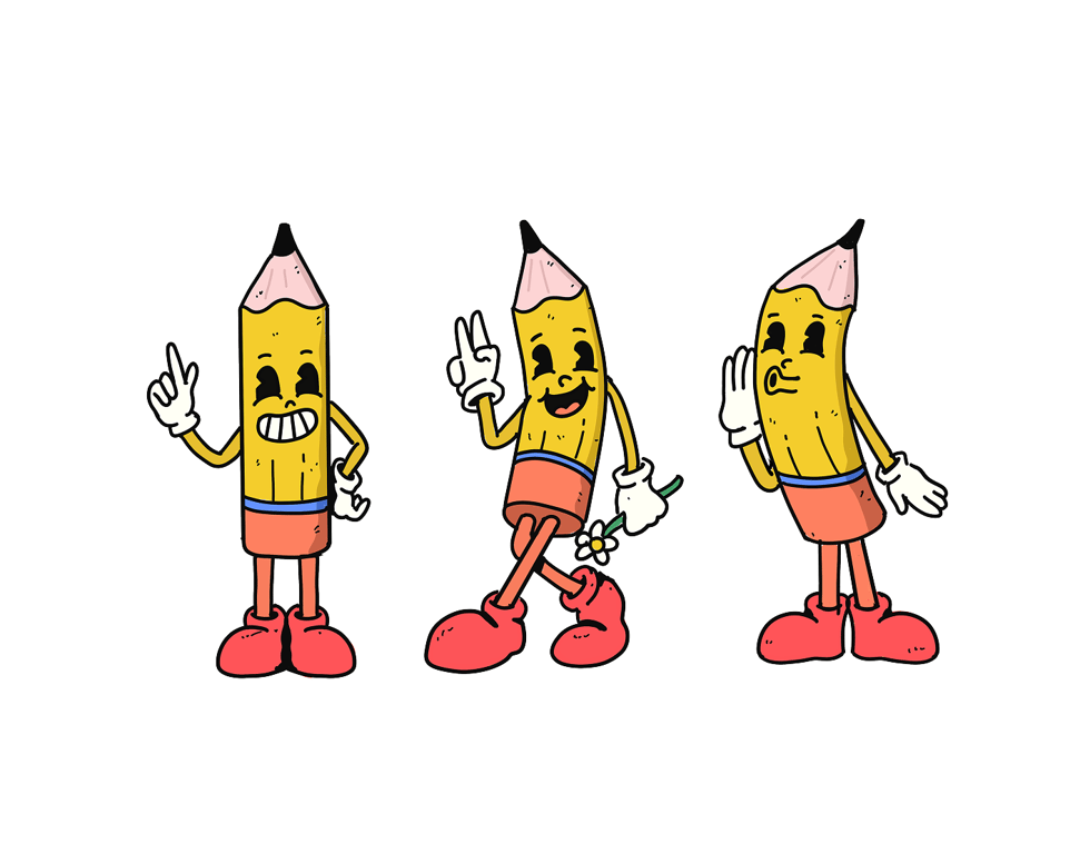
The mascot appears on the lock screen, onboarding, and success states, keeping core screens clean while giving Pensil Ajaib a distinct character inside an otherwise functional tool.
Impact
Workflow Change
Instead of a six-step cross‑tool workflow, designers now work in three steps:
- Click a layer (or frame)
- Open Pensil Ajaib, review three suggestions
- Apply the one that fits best
What previously took 4–5 minutes per component now takes under 90 seconds, roughly a 60% reduction in copy-related task time. Across a typical session of 10–15 components, that's an estimated 30–45 minutes saved per designer per session. This makes it realistic to use guideline-aligned copy even in early, fast-paced exploration moments, not only at the end of the process.
Better Use of Content Designers
Because designs now start with better placeholders:
- Content designers spend less time cleaning up inherited text
- They can focus on narrative, structure, and clarity across flows
- Product discussions in reviews can move from “change this word” to “does this flow serve the user?”
- Cataloged UI components (button, label, toast, empty state, etc.) with clear specs and examples
In public service projects, this also helps stakeholders understand intent earlier and reduces misalignment that can ripple into policy or operational decisions.
More Grounded Starting Point for Copy Review
Pensil Ajaib doesn't replace the content review process, copywriters still review and refine all final copy. But starting from a contextually relevant placeholder is meaningfully different from starting from lorem ipsum.
The plugin gives the team a shared reference point earlier, so the review cycle begins from a more informed baseline rather than from scratch.
Reflection
Building Pensil Ajaib reinforced something I have come to believe strongly: developer tools and designer tools require the same care as end-user products. The people using this plugin are my own teammates — which meant I had to think carefully about cognitive load, context-switching cost, and how much configuration was "enough" versus "too much."
Questions that guided refinement:
Which guidelines are non‑negotiable (e.g. legal wording)?
Which can flex based on audience or component?
How much rationale is enough to build trust without slowing the designer down?
The most technically interesting challenge was structuring the prompt layer so that GPT outputs stayed useful without being unpredictable. Too much freedom and the suggestions drifted from our guidelines. Too rigid and the plugin felt like a lookup table, not an assistant. Finding that balance where the output felt intelligent but still governed was the core design and engineering problem.
The next step would be expanding the system to support more product contexts and eventually allowing content designers to update guideline entries directly from the Figma, closing the loop between writing, reviewing, and applying copy in one environment.