In Tips
Making the Logo Grid Not Look Terrible
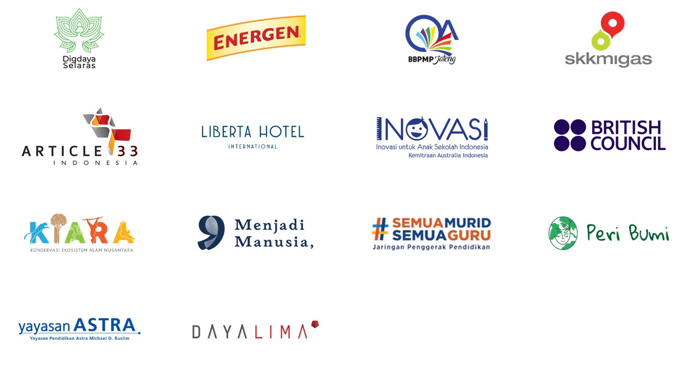
I was working on the landing page and got to the "trusted by" section — the client logo wall every startup or agency site has. Shouldn't take long, I thought. Just drop in the logos, arrange them, done.
I pulled them from wherever I could find them from brand kits, Google image searches, PDFs converted to PNG — and dropped them into a Figma frame.
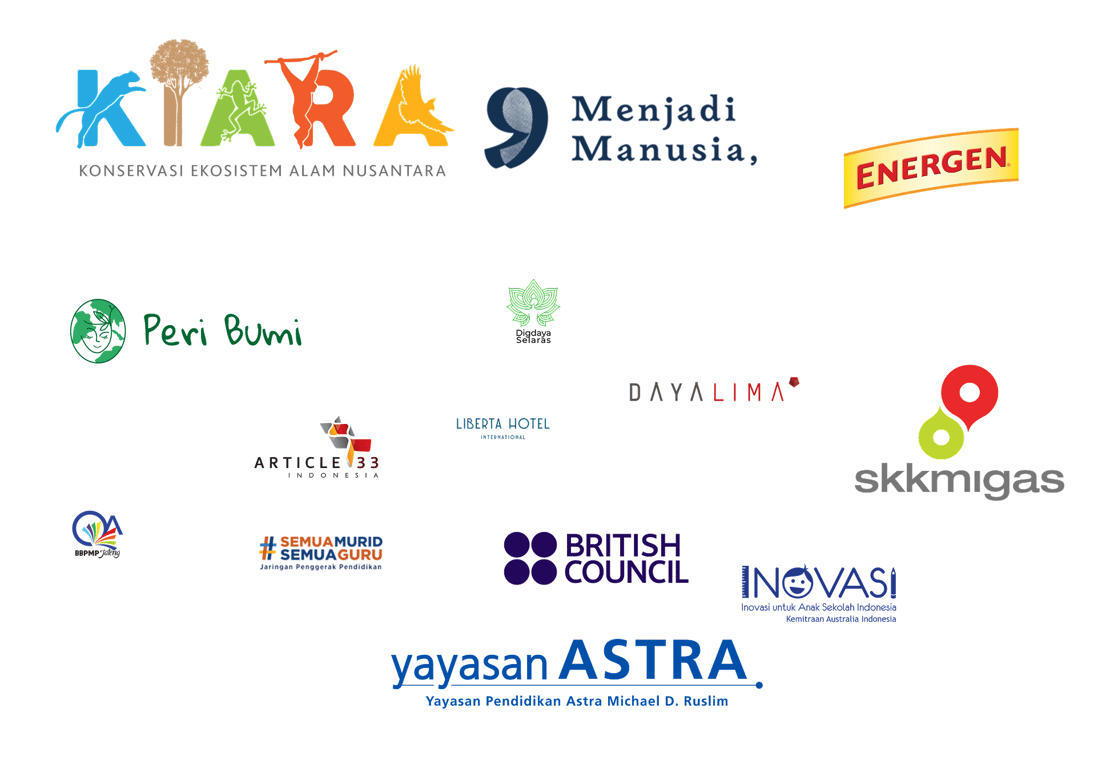
Some logos looked like billboard ads. Some looked like favicons. One was nearly invisible. The section that was supposed to take an hour clearly wasn't going to.
First Attempt: Same Height
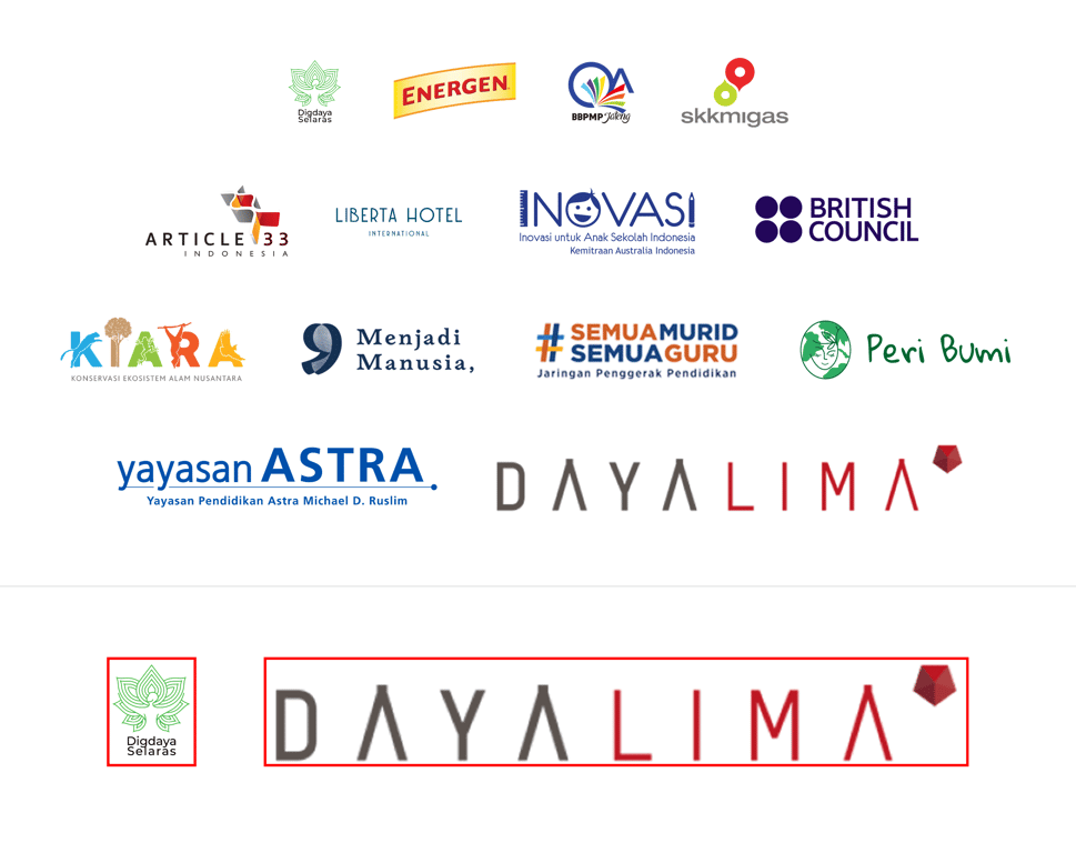
The obvious fix is to normalize everything to 80px height, maintain aspect ratio. Standard approach, mostly correct.
It helped immediately. Everything was at least the same height. But then a new problem showed up: one of the wide flat wordmarks had a 6.7:1 aspect ratio. At 80px tall, it rendered at 538px wide — nearly three times wider than most of the other logos. It dominated the entire first row. The logo itself isn't bad, it's just shaped that way, and at the same height as a square icon it has an enormous visual footprint.
Another wordmark had the same issue where it use 4.8:1 ratio, 384px wide at 80px height.
The Real Problem is Height ≠ Visual Weight
Same pixel height does not mean same visual weight.
Think of it like objects on a table, a small dense cube feels heavier than a large flat sheet of paper, even if the sheet covers more surface area. Square logos are compact and enclosed. They pull the eye in. A wide wordmark at the same height spreads across the row but much of that spread is negative space between letterforms. The square still feels louder.
So the grid looked more consistent but still not balanced. I'd solved the measurement problem without solving the visual one.
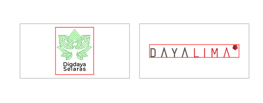
The Fix is Using Fixed Cells
The technique that actually works is giving every logo the same container or a fixed cell. Where it’s letting each logo scale to fit inside it. I used 220×110px cells with a usable area of 180×80px inside.
What this does:
- Square logos have to share the cell with empty space on the sides. They end up smaller and quieter.
- Wide horizontal logos stretch to fill the width. They get appropriate presence.
- The grid reads as uniform because the cells are uniform, not the logos themselves.
I have seen this on plenty of professional agency sites and never thought about why it worked until I had to implement it myself.
The Limits
Fixed cells solve the structure problem, but they can't fix physics. A 6.7:1 logo is always going to appear vertically thin inside a cell that's also used by square icons — you're not going to make a wide flat wordmark read the same visual weight as a circle. The best move is to accept it and be intentional about placement.
Sorting by aspect ratio or grouping similar-width logos in the same row rather than arranging alphabetically or by client size could made each row feel internally coherent instead of accidentally chaotic. It's a small thing that makes a meaningful difference. Putting the widest logo in row 1 made the whole grid look broken before anyone registered a single name.
The Result
The square icons no longer shout over everyone else. The wide wordmarks are contained.
Looking back, at least half the pain came from logos that were exported with inconsistent padding, the actual mark was a fraction of the total bounding box and from not setting up fixed cells from the start. Neither of those is a hard problem. They're just the kind of thing you only think to do after you've spent an afternoon cleaning up a mess you made yourself.
Read next
In Tips
Cara Saya Menyinkronkan Skills di Claude Code, Codex, dan Opencode
Beberapa hari ini saya sedang rajin mengkoleksi skills di Claude Code maupun Opencode — karena sangat membantu sekali dalam workflow pembuatan tools dan produk...
In Thoughts
A Beginner Designer’s Checklist Before Starting a Web3 Project
Web3 is often described as the next generation of the internet: more decentralized, with users having greater control over their own data and digital assets. It...