April 19, 2024
Behind the screens refreshing my personal site for 2024
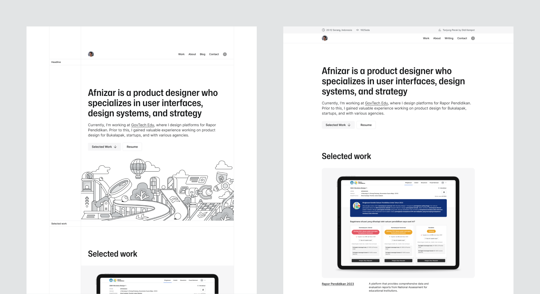
Each year, I take the opportunity to refresh my personal website with updates to the design and tech. For 2024, I've made some changes embracing a more minimalist look while keeping the focus on showcasing my work.
If you often visit this website or have scrolled all the way down, you may have noticed that in the footer there is an option for different versions of the website. It has become an annual tradition for me to revisit the design, layout, and technologies used. This year, with more time on my hands, I have more time to work on the 2024 version. It’s been a great way to keep myself occupied during the long Ramadan holiday break.
Background and motivation
A portfolio is a crucial asset for creative professionals, especially when applying for jobs. It can take various forms - websites, PDFs, printed materials, and more. Regardless of the medium, the key is to effectively showcase one’s skills and value to potential employers. This website has often served as my portfolio, albeit an incomplete one, when pursuing job opportunities.
I chose a website as the medium because of its flexibility. Not only does it function as a portfolio, but it also allows me to archive stories and experiment with web dev technologies. In addition to being flexible as a medium, it is also flexible in terms of accessibility. Websites can be easily accessed from wherever we are.
2024 theme and tech stack
The reflection when redesigning the website last year was how quickly the desired changes could be made. So in order to design and develop the design faster, I stuck to the same principle as before–getting things done quickly. This meant utilizing the Eleventy framework and maintaining a similar art direction to the previous year.
For the art direction, there’s nothing too significant; it changed from brutalist to minimalist, or as simple as possible. This involved removing unnecessary borders and creating breathing space for an improved user experience. While illustrations were temporarily removed, I plan to reintroduce them with a more authentic and gritty feel, aligning with the minimalist theme.

The foundational layout work from the previous year carried over, minimizing any additional complexities. The layout creation process was relatively quick, thanks to the power of flexbox and grid systems, which made crafting intricate layouts a breeze. Here’s a small code snippet demonstrating the use of the Raster grid system for layout:
<r-grid columns="10" class="description">
    <r-cell span="3" span-s="row">
        <p class="body-large">
            <a href="#">Title</a>
        </p>
    </r-cell>
    <r-cell span="4-10" span-s="row">
        <p class="description--project">Description</p>
        <ul>
            <li>
                <a href="#">
                    <small class="badge badge-tags helper">Tags</small>
                </a>
            </li>
        </ul>
    </r-cell>
</r-grid>
Make it open source
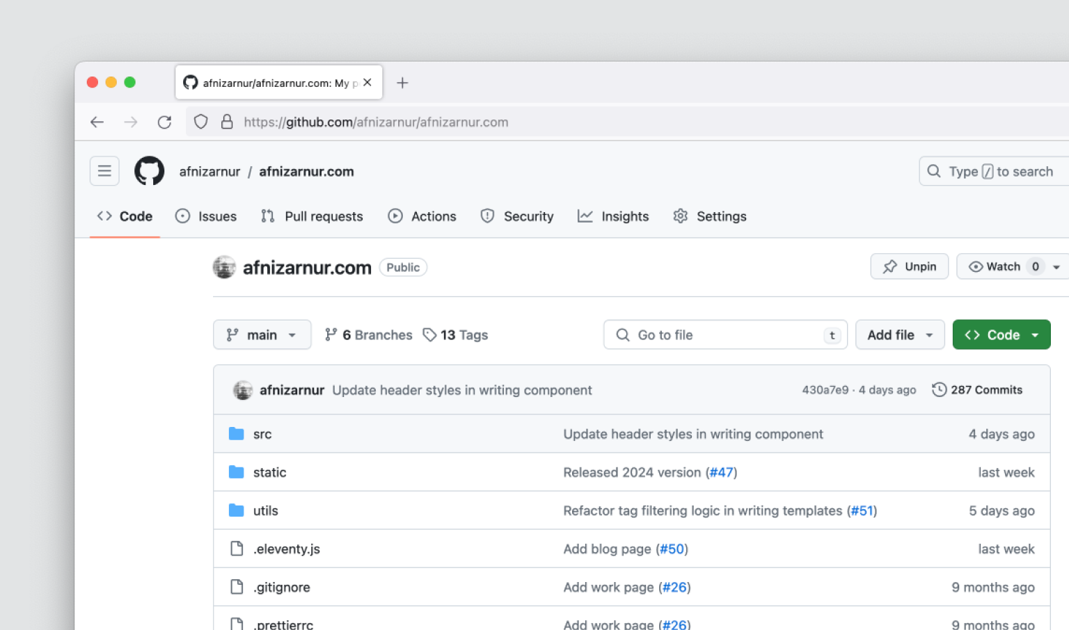
I also taken the step to open source the code for this website. The goal is to provide a learning resource for others, rather than a mere template. As always, I aim to inspire other designers who may not have explored coding to take an interest and learn from this project.

That covers the updates for this year’s website refresh. Until next time!